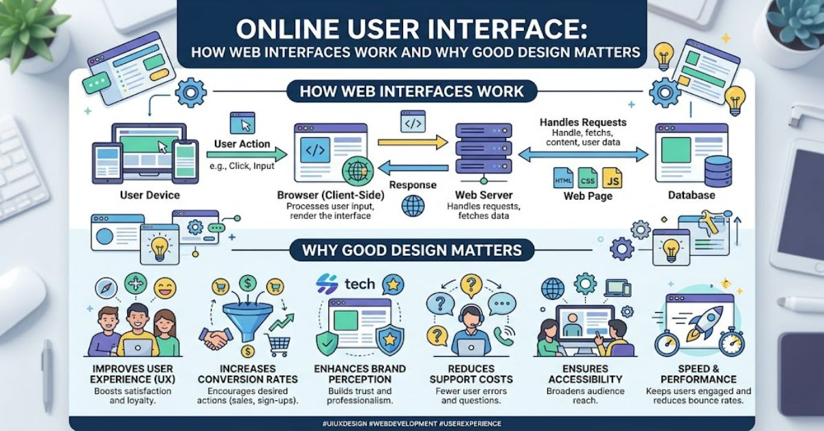
An online user interface is the visual and interactive layout on a website or web app that lets people click, type and navigate through a digital system. It is the part of a digital product that users directly encounter, whether they are searching for information, completing a form, purchasing something or managing an account.
A UI can be simple, such as a page containing a navigation bar, text and a few buttons. It can also be highly complex, combining dashboards, filters, forms, menus, notifications, data visualisations and account controls.
The distinction between interface and functionality matters. A website may have powerful software behind it, but users experience that technology through its interface. If controls are difficult to find, feedback is unclear or pages behave inconsistently, the underlying technology becomes harder to use.
Modern interface design also has to work across different screen sizes and input methods. A desktop visitor may use a mouse and keyboard, while another person may access the same service on a touchscreen. Accessibility adds further requirements, including keyboard navigation, readable content and appropriate alternatives for users who cannot interact with a conventional visual layout.
Good UI therefore involves more than choosing attractive colours. It connects information architecture, interaction design, accessibility, responsive behaviour, performance and visual hierarchy into one coherent system.
What Makes Up an Online User Interface?
The interface is usually made from several interconnected components. Each component has a specific role in helping users understand where they are and what they can do.
Common elements include navigation menus, buttons, links, search fields, forms, cards, tabs, dropdowns, notifications, modals and content areas.
| UI element | Primary purpose | Common example |
| Navigation | Helps users move between sections | Header menu |
| Button | Triggers an action | “Submit” |
| Form | Collects information | Registration form |
| Search | Finds specific content | Site search box |
| Card | Groups related information | Product listing |
| Notification | Communicates system status | Success message |
| Modal | Focuses attention on a task | Confirmation dialogue |
| Breadcrumb | Shows location within a hierarchy | Home > Products > Shoes |
The visual appearance of these components should communicate their function. A button that looks like ordinary text creates uncertainty. A form without clear labels increases the cognitive effort required to complete it.
This is where visual hierarchy becomes important. Size, spacing, contrast, positioning and typography help users identify what deserves attention first.
UI Design and User Experience Are Not the Same
UI and UX are closely related but describe different areas.
User experience concerns the broader journey a person has with a product. It includes research, information architecture, task flows, usability and the overall quality of interaction.
UI focuses more directly on the interface through which those experiences are delivered.
For example, an online shop may have excellent product photography and attractive buttons but still provide a poor experience if checkout requires unnecessary steps. Conversely, a logically structured checkout process can become difficult to use if its controls are visually confusing.
The two disciplines therefore overlap. A well-designed interface should support a well-designed user journey rather than treating appearance as the entire product.
Responsive and Accessible Interface Design
A modern interface must account for different devices. Responsive design allows layouts to adapt to changing screen widths rather than forcing one fixed desktop arrangement onto every visitor.
Navigation may collapse into a mobile menu, columns may become stacked sections and controls may increase in size for touch interaction.
Accessibility adds another layer. The Web Content Accessibility Guidelines, maintained by the World Wide Web Consortium, organise accessibility around principles including perceivability, operability, understandability and robustness.
Practical considerations include:
- Keyboard access for interactive controls
- Sufficient colour contrast
- Descriptive labels for forms
- Meaningful focus indicators
- Text alternatives for informative images
- Logical heading structures
- Compatibility with assistive technologies
Accessibility is not simply an additional feature. For many users, it determines whether an interface can be used at all.
The Technical Layer Behind the Interface
What users see is produced by several technologies working together.
HTML provides the structural foundation. CSS controls presentation and layout. JavaScript can add dynamic behaviour, such as live validation, interactive menus and asynchronous updates.
Modern web applications may also use component-based frameworks, APIs and client-side state management.
A useful interface must balance functionality with technical constraints. Heavy scripts can increase page-processing requirements. Large images can affect loading performance. Poorly managed application state can produce inconsistent interface behaviour.
This creates a practical design principle: visual sophistication should not come at the expense of usability or performance.
| Technical factor | UI consequence | Practical concern |
| JavaScript execution | Enables dynamic interaction | Excessive scripts can increase processing |
| Image size | Influences visual quality and loading | Optimise assets appropriately |
| Network latency | Affects response time | Provide meaningful loading states |
| API response | Supplies dynamic content | Handle errors clearly |
| CSS layout | Controls responsive presentation | Test multiple viewport sizes |
| Browser compatibility | Affects rendering and interaction | Validate supported environments |
Interaction States Matter More Than They Seem
One of the less obvious aspects of UI design is that an interface is not a collection of static screens. Interactive elements have states.
A button may be idle, hovered, focused, pressed, disabled or processing. A form field may be empty, active, valid or invalid. A data request may be loading, successful or unsuccessful.
Designing only the ideal state creates problems when something goes wrong.
For example, a user who presses a payment button needs feedback that the request is being processed. Without that feedback, they may press the button repeatedly, potentially creating duplicate requests.
This is a practical information gain often missed in superficial UI discussions: error and waiting states are part of the interface, not exceptions to it.
Common UI Problems and Their Trade-Offs
Interfaces frequently become harder to use when designers attempt to provide too many choices at once.
A crowded navigation system can expose many destinations but increase decision-making effort. A minimalist interface may look cleaner but hide important functionality. Large animations can create visual interest while consuming processing resources or distracting from the main task.
There is no universal rule that every interface should be minimal. The appropriate level of complexity depends on the task.
A professional dashboard, for instance, may legitimately contain numerous controls because its users need frequent access to operational information. Removing those controls simply to create a cleaner appearance could reduce efficiency.
The more useful question is whether complexity corresponds to user needs.
Three Practical Insights for Evaluating a UI
Look beyond appearance. A visually polished interface can still fail if users cannot complete important tasks efficiently.
Test failure states. Review what happens when a network request fails, a form contains incorrect information or content takes time to load. These states reveal weaknesses that static screenshots conceal.
Measure interaction cost. Count the steps, decisions and information users must process for important tasks. Reducing unnecessary friction can be more valuable than adding another visual feature.
These points also explain why documented usability testing is more meaningful than relying solely on aesthetic judgement.
The Future of Online User Interface in 2027
By 2027, web interfaces are likely to continue incorporating more conversational and adaptive interaction patterns. Generative AI is already changing how users search, create and manipulate digital content, while browser technologies continue to support richer application behaviour.
The likely direction is not the disappearance of conventional controls. For many tasks, buttons, menus, tables and forms remain efficient because they provide predictable affordances.
AI-assisted interfaces may instead add another interaction layer. A user might describe a desired outcome in natural language while conventional controls remain available for precise adjustments.
Accessibility and privacy will remain important constraints. More sophisticated interfaces can create additional risks if they obscure system behaviour, collect excessive information or make automated decisions difficult to understand.
The technical challenge will therefore be balancing flexibility with predictability. An interface that can adapt to a user should still communicate what it is doing and allow meaningful correction.
Key Takeaways
- An online user interface is the interaction layer connecting users with a website or web application.
- Navigation, controls, forms and feedback should communicate their purpose clearly.
- UI and UX overlap but address different aspects of digital product design.
- Responsive behaviour is essential because users access websites across different devices and screen sizes.
- Accessibility should be considered during interface design rather than added after development.
- Loading, error and disabled states are important parts of the interface.
- Technical performance can directly affect how usable an interface feels.
Conclusion
An online user interface is ultimately a communication system. It tells people where they are, what information is available, which actions are possible and what happened after they acted.
Strong UI design combines visual hierarchy with functional clarity. It considers responsive layouts, accessibility, performance, interaction states and the technical systems supporting the visible experience. It also recognises that different products require different levels of complexity.
The most effective interface is not necessarily the simplest-looking one. It is the one that helps its intended users complete meaningful tasks with appropriate effort and clear feedback.
As websites and web applications incorporate more dynamic and AI-assisted features, these fundamentals remain relevant. New technology may change how people interact with software, but clarity, accessibility, predictable behaviour and useful feedback continue to provide the foundation for a dependable digital interface.
FAQ
What is an online user interface?
An online user interface is the visual and interactive part of a website or web application. It includes elements such as menus, buttons, forms, search tools and other controls that allow users to interact with digital functionality.
What is the difference between UI and UX?
UI focuses primarily on the interface and its interactive visual components. UX covers the broader user journey, including usability, information architecture, task flows and overall interaction with a product.
What are examples of online UI elements?
Examples include navigation menus, buttons, search boxes, forms, dropdowns, tabs, cards, notifications, modals and dashboards.
Why is responsive UI important?
Responsive UI allows a website or web application to adapt to different screen sizes and input environments. This helps maintain usability across desktops, tablets and mobile devices.
What makes a web interface accessible?
Accessible interfaces provide features such as keyboard navigation, readable content, appropriate contrast, descriptive labels, visible focus states and suitable support for assistive technologies.
Does good UI improve website performance?
UI design can influence perceived and actual performance. Large assets, excessive scripts and inefficient rendering can increase loading or processing requirements, while appropriate optimisation can make interactions feel faster.
Methodology
This article uses established web-design terminology and publicly documented accessibility and web-platform principles. The discussion distinguishes interface design from broader UX practice and avoids presenting fabricated user-testing results as firsthand observations.
No original usability test was conducted for this article, so no invented performance measurements or personal testing claims have been included. Technical explanations are intended as general guidance rather than a substitute for testing a specific website, browser or application.
The main limitation is that UI quality is context-dependent. A design appropriate for an enterprise dashboard may be unsuitable for a consumer website. Accessibility and performance should therefore be evaluated against the actual users, content and technical environment.
References
World Wide Web Consortium. (2023). Web Content Accessibility Guidelines (WCAG) 2.2. W3C.
World Wide Web Consortium. (2024). HTML: Living Standard and web platform guidance. W3C.
Mozilla Developer Network. (2025). Web technology for developers. Mozilla.
Google. (2024). Web performance and Core Web Vitals documentation. Google Search Central.
Nielsen Norman Group. (2024). User interface design and usability research. Nielsen Norman Group.