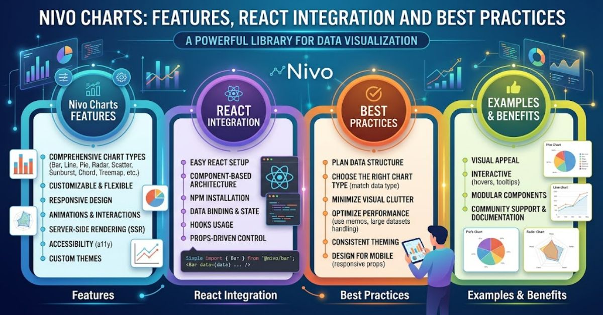
Nivo charts help developers transform complex datasets into clear, interactive visualisations. Built on React and D3, Nivo provides reusable components for creating bar charts, line graphs, pie charts, heatmaps and other visual representations. It reduces the need to write low-level rendering code while allowing developers to customise colours, labels, tooltips and layouts.
The library is useful for business dashboards, financial reports, analytics platforms and applications that present changing information. Developers can select a chart component, provide structured data and configure its appearance to suit their requirements.
However, choosing a visualisation library involves more than finding attractive chart designs. Performance, accessibility, responsiveness and compatibility with the existing application also matter. A chart that works well with a small dataset may behave differently when displaying thousands of data points.
Understanding these trade-offs helps developers decide when Nivo is appropriate and how to use it effectively. Its flexible components provide a strong foundation, but reliable visualisations still depend on accurate data, suitable chart selection and careful implementation.
What Is Nivo?
Nivo is an open-source library that simplifies data visualisation in React applications. It builds on D3’s visualisation capabilities and presents them through configurable React components.
The project includes chart types such as bar charts, line charts, pie charts, scatter plots, treemaps, radar charts and heatmaps. Developers can customise chart elements without building every graphical component from scratch.
Its main features include responsive layouts, interactive tooltips, legends, animation options and configurable colour schemes. Many chart families offer different rendering approaches, including SVG and Canvas.
These features make Nivo suitable for applications requiring consistent visualisation across several pages. Nevertheless, developers should check the documentation for the specific component because available options vary between chart types.
Popular Nivo Chart Types
Different visualisations answer different questions. Choosing the right format is essential for communicating information accurately.
| Chart type | Common use | Main limitation |
| Bar chart | Comparing categories | Long labels can become crowded |
| Line chart | Showing trends over time | Poorly chosen scales can mislead |
| Pie chart | Displaying simple proportions | Numerous slices are difficult to compare |
| Heatmap | Identifying patterns across dimensions | Colour scales need careful selection |
| Scatter plot | Exploring relationships between variables | Overlapping points can hide patterns |
| Treemap | Representing hierarchical data | Small sections may be unreadable |
For example, a sales dashboard might use a line chart for monthly revenue and a bar chart for comparing product categories. A heatmap could reveal which days generate the highest customer activity.
The chart should serve the analytical question rather than merely decorate the interface.
How to Use Nivo in React
Developers can install the package required for their chosen chart. For a bar chart, the installation command is:
npm install @nivo/bar
A simple implementation looks like this:
import { ResponsiveBar } from ‘@nivo/bar’;
const data = [
{ month: ‘January’, sales: 120 },
{ month: ‘February’, sales: 180 },
{ month: ‘March’, sales: 150 }
];
export default function SalesChart() {
return (
<div style={{ height: 320 }}>
<ResponsiveBar
data={data}
keys={[‘sales’]}
indexBy=”month”
margin={{
top: 20,
right: 20,
bottom: 50,
left: 60
}}
padding={0.3}
/>
</div>
);
}
This example supplies a dataset, identifies the value field and assigns month names to the horizontal categories. The container has an explicit height so the responsive chart can calculate its dimensions.
Production applications should also handle loading states, invalid data and API errors. Formatting values as percentages, dates or currency can make the information easier to interpret.
SVG and Canvas Rendering
Nivo offers different rendering options for supported chart types. Each has advantages and limitations.
| Feature | SVG | Canvas |
| Element customisation | Detailed control over individual elements | Individual marks are less directly accessible |
| Large visualisations | Numerous elements can increase browser workload | Can suit dense datasets |
| Accessibility | Elements can be inspected and labelled individually | Usually needs additional accessible alternatives |
| Best use | Interactive dashboards and detailed charts | Dense visualisations requiring efficient drawing |
SVG is often a sensible starting point because its elements support detailed styling and interaction. Canvas may be useful when displaying large numbers of graphical marks.
However, Canvas does not guarantee better overall performance. Data processing, React updates and event handling can also create bottlenecks. Testing with realistic datasets is more reliable than choosing a rendering method based on assumptions.
Benefits and Limitations
Nivo offers several practical advantages. Its component-based design reduces repetitive code, while its configuration options support consistent visual styling. Developers can build different charts within the same application without designing every element independently.
The library also provides flexibility for specialised dashboards. Teams can configure legends, axes, tooltips and animations to support different reporting requirements.
There are limitations to consider. Advanced customisation may require familiarity with React components and D3 concepts. Large datasets can affect performance, and accessibility features may vary between implementations. Dependencies and package compatibility also require ongoing maintenance.
Developers should therefore evaluate the specific charts they need rather than assuming every feature works identically across the library.
Accessibility and Performance Best Practices
Accessible charts should communicate information to users with different abilities. Developers should use readable labels, sufficient colour contrast and keyboard-accessible interactions where appropriate. Important information should not rely on colour alone.
Providing an accompanying table or concise text summary can help users access the underlying data when graphical interpretation is difficult.
Performance testing is equally important. Measure rendering time, responsiveness and update behaviour with representative data volumes. Avoid unnecessary animations and excessive visual detail when they do not improve understanding.
Responsive components also require containers with measurable dimensions. Missing height or width can prevent a chart from displaying correctly.
The Future of Nivo Charts in 2027
React-based visualisation tools are likely to remain relevant as organisations expand their use of dashboards and interactive reporting. Nivo’s reusable components and configurable rendering options position it as one option for these applications.
Accessibility will remain an important consideration. The European Accessibility Act began applying to covered products and services on 28 June 2025, although its requirements do not apply to every dashboard or organisation.
Developers should also monitor package maintenance, React compatibility and changes to component APIs. Future features and performance improvements should be assessed through published release information rather than assumed.
Key Takeaways
- Choose chart types according to the question being answered.
- Use SVG or Canvas based on measured requirements.
- Give responsive charts containers with explicit dimensions.
- Test accessibility and provide alternatives for essential information.
- Validate data before presenting it to users.
- Review dependencies and compatibility during maintenance.
Frequently Asked Questions
What are Nivo charts used for?
They help React developers create interactive charts for analytics dashboards, reports and data-driven applications.
Is Nivo free?
Nivo is an open-source project distributed under the MIT licence. Check the project licence and relevant dependency licences before deployment.
Is Nivo better than Chart.js?
Neither is universally better. Nivo offers configurable React components and multiple rendering approaches, while Chart.js provides a different charting API. The right choice depends on project requirements.
Can Nivo handle large datasets?
Some Canvas-based implementations suit dense visualisations, but performance depends on chart type, browser and data volume. Benchmark the intended use case.
Does Nivo support responsive charts?
Yes. Responsive components adapt to their container when measurable dimensions are available.
Conclusion
Nivo provides React developers with a flexible way to create interactive data visualisations without building every chart from low-level graphics primitives. Its chart selection, responsive components and customisation options make it useful for analytical applications.
Successful implementation still requires careful decisions. Developers must select appropriate visualisations, validate their datasets, test performance and address accessibility. SVG and Canvas each offer advantages, but neither is ideal for every situation.
For teams working with React, Nivo is worth evaluating through a small prototype that uses realistic data. This approach can reveal compatibility issues and performance constraints before development expands. Ultimately, clear communication and reliable information matter more than decorative effects.
Methodology
This article draws on Nivo’s official documentation, component examples and project repository. No independent performance testing or interviews were conducted. APIs and rendering behaviour may change between versions, so developers should verify implementation details against their installed package.