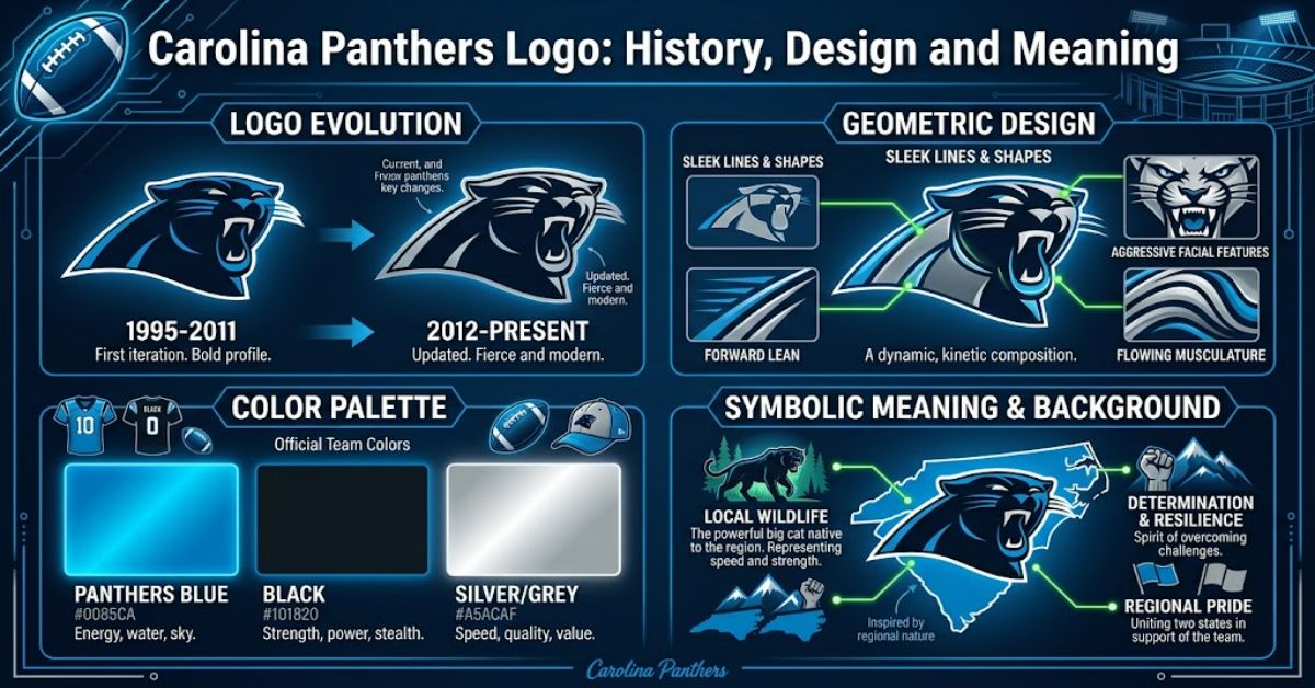
The Carolina Panthers logo is one of the clearest examples of how a professional sports emblem can communicate a team’s identity without relying on complicated imagery. It uses the profile of a roaring black panther, framed by the club’s distinctive blue colour, to create an image that feels aggressive, fast and immediately recognisable.
The Panthers entered the NFL in 1995 as an expansion franchise, and the original branding was built around a combination of black, Panther Blue and silver. The team’s identity has remained remarkably consistent since its debut. In 2012, however, the franchise introduced a refined version of its logo, making subtle changes to the panther’s eye, mouth and overall dimensional appearance. The Panthers said the update was intended to create a more contemporary mark that would work effectively in increasingly digital environments.
That approach explains why the emblem still looks familiar more than a decade after the redesign. It was not a complete rebrand. Instead, the club modernised an established symbol while preserving the visual features supporters already associated with the team.
When Did the Carolina Panthers Logo First Appear?
The Panthers became an NFL franchise in 1995. Their arrival was part of the league’s expansion, with Carolina and Jacksonville beginning play during the same season. The Panthers’ original identity immediately used the panther as its central visual symbol.
The choice was logical from a branding perspective. A panther can communicate speed, strength, stealth and aggression, qualities that translate naturally into professional American football.
The colours were equally important. The NFL’s official records identify the Panthers’ team colours as black, Panther Blue and silver. That combination gave the new franchise a visual identity that was distinct from many established NFL teams.
The result was a mark that could work across helmets, uniforms, merchandise, signage and broadcast graphics without requiring a complicated wordmark.
What Does the Panther Symbol Represent?
The central figure is a panther shown in profile, with its mouth open and teeth visible. The expression creates a sense of movement and aggression rather than calm or neutrality.
That distinction is important. Sports logos are often designed to communicate emotion before a viewer has time to process the details. A roaring animal immediately suggests confrontation and physical power, making the image suitable for a competitive sport.
The Panthers’ 2012 refinement strengthened that effect. According to the club, the updated design made the panther more aggressive and defined while giving the mark a more three-dimensional appearance. The changes focused particularly on the eye and mouth.
| Logo element | Visual function | Brand effect |
| Panther profile | Provides the central identity | Strength and aggression |
| Open mouth | Creates movement and tension | Competitive character |
| Blue outline | Separates the animal from its background | Team recognition |
| Black interior | Provides strong visual weight | Boldness and authority |
| Silver surroundings | Connects with the wider team palette | Consistency across uniforms |
The 2012 Logo Refinement
The most important modern change came in 2012.
On 29 January 2012, the Panthers announced that they had refined their logo and logotype. It was the first logo change since the franchise entered the NFL in 1995. The club described the new version as a modernised interpretation of the existing identity rather than a replacement.
Several details were adjusted. The eye and mouth received particular attention, while the white outline surrounding the older logo was removed. The Panthers explained that this created a more dimensional appearance and placed greater emphasis on the panther’s facial features.
The change also reflected a wider shift in sports branding. Logos increasingly needed to function on websites, mobile screens, social media, video graphics and digital merchandise. A mark designed for a physical helmet or printed programme also had to remain recognisable at much smaller sizes.
That made subtle simplification valuable.
Carolina Panthers Logo Colours Explained
Colour is one of the strongest parts of the Panthers’ identity.
The official palette includes black, Panther Blue and silver. The NFL’s records continue to list these three colours as the team’s official colours.
Black provides the dominant visual weight. It reinforces the panther’s intimidating appearance and creates a strong contrast against lighter backgrounds.
Panther Blue gives the identity its most recognisable accent. Rather than relying entirely on black and silver, the blue creates a distinctive colour signature that supporters can associate with Carolina.
Silver completes the system and has historically been especially visible on the team’s helmets and uniform combinations.
This consistency matters because sports branding is experienced through many separate objects. A fan may see the emblem on a helmet, jersey, cap, flag or digital graphic. Consistent colour usage helps those separate items feel like parts of one identity.
How the Logo Works on the Helmet
The helmet is arguably the most important physical application of an NFL logo.
The Panthers have traditionally used the panther emblem on their helmet, making the profile visible from the side during games. The logo therefore becomes part of the visual language of the sport itself rather than simply an advertising mark.
The 2012 refinement was incorporated into the team’s silver helmet as part of the wider uniform update.
This application also demonstrates why the design does not depend on small details to remain recognisable. The broad silhouette of the panther can still be identified quickly when viewed from a distance.
Original Logo vs Refined Logo
The change between the two versions is better described as evolution than reinvention.
| Feature | Original identity | Refined identity |
| Introduction | 1995 | 2012 |
| Panther profile | Core feature | Retained |
| Colour identity | Black, Panther Blue and silver | Retained |
| Facial details | Original treatment | More defined |
| Dimensional appearance | Flatter | More three-dimensional |
| White outer outline | Present | Removed |
| Overall strategy | Establish franchise identity | Modernise established identity |
The Panthers’ approach avoided a common branding problem: changing a familiar symbol so dramatically that supporters no longer recognise it.
Instead, the 2012 version preserved the core silhouette while improving its digital and visual performance.
Why the Logo Has Lasted
The longevity of the emblem comes partly from its simplicity.
There is one dominant subject, one clear direction and a limited colour palette. The design does not depend on a complicated background or a large amount of text.
That makes it flexible.
A successful sports logo needs to work at different sizes and in different environments. It may appear on a helmet during a televised match, on a small social-media icon, on a large stadium sign or embroidered onto clothing.
The Panthers’ emblem is structurally suited to those applications because the main identifying feature is the animal’s silhouette and face.
Risks of Changing an Established Sports Logo
Updating a sports logo carries a significant branding risk. Supporters develop emotional relationships with visual symbols, particularly when those symbols have been present through important seasons and memorable games.
The Panthers avoided a major disruption in 2012 by retaining the central panther image.
This is a useful branding lesson: an established identity does not always need a complete redesign. Sometimes small changes to proportion, expression, outlines and dimensional treatment can make a mark feel contemporary without disconnecting it from its history.
The challenge is finding the point at which refinement becomes unnecessary alteration.
The Logo and Panthers’ Sporting Identity
The emblem also developed alongside the team’s history.
Carolina’s first season was in 1995, and the franchise quickly became known for establishing a strong identity despite being new to the league. In 1996, only the team’s second season, the Panthers reached the NFC Championship Game.
The franchise later reached two Super Bowls, following the 2003 and 2015 seasons. Those major appearances helped place the Panthers’ visual identity in front of national and international audiences.
As a result, the logo became more than a decorative symbol. It became attached to particular eras, players, victories and disappointments in the club’s history.
The Future of the Carolina Panthers Logo in 2027
There is currently little evidence that the Panthers need another major logo redesign. The club’s recent branding history suggests continuity rather than frequent reinvention.
The 2012 refinement was specifically designed to modernise the existing identity for digital use. More than a decade later, that principle remains relevant as sports branding becomes increasingly dependent on mobile interfaces, streaming broadcasts and social platforms.
The more likely future is continued adaptation through uniforms, alternate applications and digital presentation rather than replacing the central panther mark.
The Panthers have already demonstrated that the same emblem can work across traditional and digital formats. Unless the organisation decides to reposition its wider brand, preserving the familiar symbol offers a lower-risk strategy than starting again.
Key Insights
- The logo’s longevity is partly a result of its simple silhouette and restricted colour palette.
- The 2012 update demonstrates that brand modernisation does not necessarily require a new symbol.
- The removal of the white outline helped make the refined mark feel more dimensional and focused.
- The team’s black, Panther Blue and silver palette creates recognition beyond the logo itself.
- The helmet remains one of the most important applications because it turns the emblem into a visible part of live competition.
- The logo’s emotional meaning has grown through its association with the franchise’s history.
- Digital scalability was an explicit consideration in the 2012 refinement.
Conclusion
The Carolina Panthers logo has remained remarkably consistent since the franchise entered the NFL in 1995. Its roaring panther profile communicates aggression and strength, while black, Panther Blue and silver establish a distinctive visual identity.
The 2012 refinement shows how an established sports brand can evolve without abandoning its history. By adjusting the eye, mouth, dimensional treatment and outline, the Panthers created a cleaner and more contemporary version of a symbol supporters already knew.
That balance between recognition and modernisation is arguably the logo’s greatest strength. It works on helmets, uniforms, merchandise and digital platforms while retaining the basic visual idea introduced with the franchise.
Rather than depending on constant redesigns, the Panthers have built their identity around a single recognisable animal symbol and a consistent colour system. That continuity gives the logo a stronger connection to the team’s history and helps explain why it remains one of the most distinctive marks in American professional sport.
FAQ
What does the Carolina Panthers logo look like?
It features a stylised black panther in profile, with a fierce expression and a blue outline. The design is used across Panthers helmets, uniforms, merchandise and other branding.
When was the Carolina Panthers logo created?
The original logo was introduced when the Panthers entered the NFL in 1995. The team later refined the design in 2012.
What colours are used in the Panthers logo?
The Panthers’ official team colours are black, Panther Blue and silver.
Did the Panthers change their logo in 2012?
Yes. The franchise announced a refined logo on 29 January 2012. Changes included adjustments to the eye and mouth, a more dimensional appearance and removal of the white outer outline.
Why did the Panthers refine the logo?
The club wanted a more modern and aggressive appearance that would also work effectively across increasingly digital applications.
Is the current logo the same as the original?
It retains the original panther concept but is a refined version. The 2012 update changed several visual details while preserving the central identity.
Methodology
This article was developed from the RubbleMagazine production brief, which identifies “carolina panthers logo” as the core keyword and specifies the black panther, blue colourway and aggressive profile as the primary framing.
Historical and branding information was checked against official Carolina Panthers and NFL material, including the team’s 2012 announcement of the refined logo, NFL team records and the franchise’s historical chronology.
No independent hands-on logo testing or interviews were conducted for this article. Therefore, no fabricated firsthand observations or invented practitioner quotations have been included. The main limitation is that visual interpretation, such as describing the logo as aggressive or powerful, involves an element of design analysis rather than a directly measurable fact.
References
Carolina Panthers. (2012, 29 January). Panthers introduce refined logo. Carolina Panthers.
Carolina Panthers. (2012, 3 April). Panthers uniforms unveiled. Carolina Panthers.
Carolina Panthers. (2023). Team chronology. Carolina Panthers.
National Football League. (2025). NFL Record & Fact Book. National Football League.
National Football League. (2026). Carolina Panthers team information. National Football League.