
Within the United States, state flags serve as visual representations of local history, geography, culture, and political identity. While national flags often receive the most attention, state banners play an important role in public buildings, schools, government institutions, sporting events, and civic ceremonies.
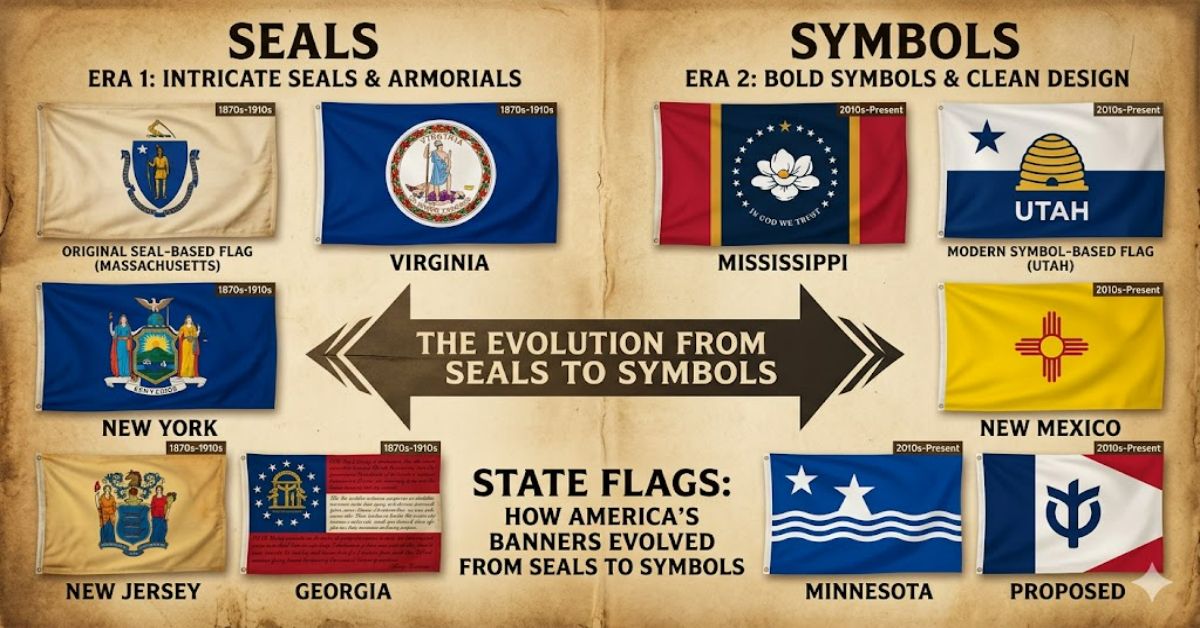
For decades, many American states relied on a similar formula: placing their official state seal on a dark blue background. Critics often describe this approach as the “seal on a bedsheet” style because the designs can appear nearly identical from a distance. In recent years, however, several states have reconsidered their visual identities, embracing cleaner geometry, stronger symbolism, and greater public recognition.
This shift reflects more than aesthetics. Flag redesigns reveal changing attitudes toward heritage, inclusivity, civic branding, and public engagement. As communities seek symbols that resonate with modern audiences while respecting historical roots, state banners have become subjects of public debate and cultural discussion.
Understanding these developments requires examining where these flags came from, why many designs look alike, and what lessons can be learned from successful redesign efforts across the country.
The Historical Purpose of State Flags
State banners emerged primarily during the late nineteenth and early twentieth centuries. Many states adopted official flags for exhibitions, military units, and government functions.
Unlike national flags, which often developed through revolutionary movements or independence struggles, state flags were frequently administrative creations. Legislatures commissioned designs that incorporated existing seals, coats of arms, and official emblems.
The result was practical but not always visually effective.
Common Historical Elements
Many state designs incorporated:
- Official seals
- Agricultural imagery
- Historical scenes
- State mottos
- Government symbols
- Native wildlife and plants
These elements carried meaning but often produced highly detailed designs that became difficult to recognise at a distance.
Why So Many State Flags Look Similar
One of the most common criticisms of American state flag design is visual uniformity.
The majority of states adopted banners featuring an official seal placed on a solid-colour background, usually blue. This approach prioritised symbolism over visibility.
Comparison of Traditional and Modern Approaches
| Design Feature | Traditional Seal-Based Flags | Modern Simplified Flags |
| Recognition at distance | Low | High |
| Symbol complexity | Very high | Moderate |
| Reproduction cost | Higher | Lower |
| Educational value | Detailed historical context | Focused symbolic meaning |
| Civic branding effectiveness | Limited | Strong |
| Memorability | Often weak | Usually stronger |
Flag scholars frequently reference principles promoted by the North American Vexillological Association (NAVA), which advocates simplicity, meaningful symbolism, limited colours, and minimal text.
The Rise of Modern Flag Design
Over the past decade, several states have reconsidered their visual identity.
A major influence has been the growing public interest in vexillology—the study of flags. Social media, design communities, and civic organisations have brought increased attention to effective flag design.
Mississippi’s Redesign
In 2020, Mississippi retired its previous flag, which included Confederate imagery, and adopted a new design featuring a magnolia blossom surrounded by stars.
The redesign process involved public consultation and extensive discussion regarding representation and historical context.
Utah’s New Flag
Utah adopted a new flag in 2024 featuring a beehive symbol, mountain imagery, and strong geometric shapes.
The redesign aimed to improve recognition while maintaining historical references important to state residents.
Minnesota’s New Approach
Minnesota also introduced a redesigned banner in 2024, replacing a highly detailed seal-based design with a simpler visual system inspired by the state’s geography and identity.
These examples illustrate a broader trend: modernisation without complete abandonment of heritage.
Structured Insight: Recent State Flag Redesigns
| State | Year Adopted | Primary Symbol | Design Goal |
| Mississippi | 2020 | Magnolia flower | Replace controversial imagery |
| Utah | 2024 | Beehive | Improve recognition and symbolism |
| Minnesota | 2024 | State shape and star | Modern civic identity |
| Maine (proposed revival discussions) | Ongoing | Pine tree and star | Historical simplicity |
| Massachusetts (under review discussions) | Ongoing | Potential redesign concepts | Greater inclusivity |
What Makes a Great State Flag?
Successful banners generally achieve a balance between symbolism and simplicity.
Recognisability
A child should be able to draw the design from memory. This principle is often cited within flag-design communities because recognisability directly influences public attachment.
Distinctive Colour Palette
Strong colour choices improve visibility and reduce confusion with neighbouring states.
Meaningful Symbolism
Symbols should represent unique aspects of local history, geography, or culture.
For example:
- Utah’s beehive reflects industry and community.
- New Mexico’s sun symbol references Indigenous heritage.
- Colorado’s red “C” reflects the state’s name and landscape.
Cultural Significance Beyond Government Buildings
The importance of state banners extends well beyond official ceremonies.
Sports fans display them at stadiums. Businesses incorporate them into branding. Tourism campaigns use them to reinforce local identity.
In many cases, an effective flag becomes a cultural shorthand for a state’s character.
Real-World Observation
One notable example is New Mexico’s flag, consistently ranked among the strongest state flag designs by vexillologists. Its clean yellow field and red Zia symbol appear frequently on merchandise, clothing, and public art.
This widespread adoption demonstrates an important insight often overlooked in discussions about state banners: recognisable flags generate organic public use.
Many seal-based designs rarely achieve similar visibility outside government settings.
Hidden Challenges in Flag Redesign Projects
Redesign efforts are rarely straightforward.
Historical Attachment
Residents often develop emotional connections to existing symbols, regardless of design quality.
Political Debate
Changes can become politically charged when historical narratives or cultural representation are involved.
Cost Considerations
Updating signage, educational materials, government buildings, and official documents creates transitional costs.
Original Insight #1
The largest obstacle to redesign is often not visual preference but institutional inertia. Government systems, procurement contracts, and archival materials create significant barriers to change.
The Economic Impact of Strong Visual Identity
An often-overlooked aspect of state flags involves economic value.
A recognisable symbol can support:
- Tourism campaigns
- Merchandise sales
- Civic engagement initiatives
- Educational programmes
- State branding efforts
Original Insight #2
Highly recognisable designs function similarly to corporate logos. While state governments rarely frame them this way, modern visual identity increasingly influences public perception and marketability.
States with distinctive banners frequently see greater voluntary public adoption.
Lessons from Successful Flag Design
Several patterns emerge when examining highly regarded state flags.
Common Characteristics
- Limited colour palettes
- Strong geometric forms
- Meaningful symbolism
- No detailed text
- Visibility at long distances
These principles appear repeatedly in successful designs across different countries and regions.
Original Insight #3
Many redesign discussions focus heavily on historical symbolism while underestimating practical visibility. A symbol that cannot be recognised from across a street struggles to fulfil its primary communicative purpose.
Risks and Trade-Offs of Simplification
Although modern designs often receive praise, simplification is not universally welcomed.
Potential Drawbacks
- Loss of historical detail
- Reduced representation of complex heritage
- Public resistance to change
- Perception of trend-driven design choices
Critics sometimes argue that minimalist designs prioritise aesthetics over historical storytelling.
Supporters counter that symbols work best when they communicate clearly and quickly.
The debate reflects a broader cultural question: should public symbols prioritise information or recognition?
The Future of State Flags in 2027
By 2027, discussions surrounding American civic symbols are likely to continue.
Several trends appear likely:
Continued Modernisation
States with low-recognition banners may face increasing public pressure to explore alternatives.
Public Participation
Future redesign processes will probably involve greater citizen involvement through surveys, public submissions, and digital voting platforms.
Stronger Civic Branding
State governments increasingly compete for tourism, investment, and talent attraction. Visual identity may become a more strategic consideration.
Preservation of Heritage
At the same time, historical organisations will continue advocating for preservation of traditional symbols and historical context.
The most successful future projects will likely blend heritage with modern design principles rather than choosing one over the other.
Key Takeaways
- State banners remain important symbols of civic identity and regional pride.
- Traditional seal-based designs often struggle with visibility and recognition.
- Modern redesigns in Utah, Mississippi, and Minnesota reflect broader cultural shifts.
- Effective flag design balances symbolism, simplicity, and memorability.
- Economic and branding considerations increasingly influence redesign discussions.
- Public consultation has become a crucial component of successful modernisation efforts.
- The debate between heritage preservation and visual clarity will continue shaping future changes.
Conclusion
The story of state flags is ultimately a story about identity. These banners represent far more than government administration; they reflect how communities choose to see themselves and how they wish to be recognised by others.
For much of American history, detailed seals on blue backgrounds served as the dominant design model. While these flags carried important symbolism, they often struggled to achieve distinctiveness and public recognition. Recent redesign efforts demonstrate a growing awareness that visual clarity matters alongside historical meaning.
The ongoing movement towards cleaner, more recognisable designs does not necessarily reject tradition. Rather, it seeks to communicate heritage more effectively in a modern context. As states continue evaluating their symbols, the challenge will remain the same: creating banners that honour the past while remaining relevant to future generations.
Whether traditional or contemporary, the strongest flags succeed because they give people a sense of belonging, place, and shared identity.
FAQ
What are state flags used for?
State flags are used by government institutions, schools, military organisations, public events, and civic ceremonies. They serve as official symbols of a state’s identity and heritage.
Why do many American state flags look similar?
Many were designed during the late nineteenth and early twentieth centuries using the same formula: an official state seal placed on a blue background. This created visual similarities across numerous states.
Which state flag is considered the best designed?
Many vexillologists rank New Mexico’s flag among the strongest due to its simplicity, symbolism, and recognisability.
Why are some states redesigning their flags?
States pursue redesigns to improve visibility, increase public recognition, address controversial symbolism, and create stronger civic identity.
What is the “seal on a bedsheet” criticism?
The phrase refers to state flags that feature detailed seals placed on plain blue backgrounds, making them difficult to distinguish from one another.
How are new state flags chosen?
Processes vary but often include legislative approval, public submissions, expert review panels, and community consultation.
Will more states redesign their flags in the future?
Possibly. Growing interest in civic branding and effective design has increased discussion about updating older state banners.
Methodology
This article was prepared using publicly available information from state government publications, flag design organisations, legislative records, and historical archives. Recent redesign efforts in Mississippi, Utah, and Minnesota were used as contemporary case studies because they provide documented examples of public consultation and visual modernisation.
Limitations include the subjective nature of design evaluation and differing public opinions regarding historical preservation versus simplification. Perspectives from both redesign advocates and traditionalists were considered to maintain balance.
Editorial Disclosure
This article was drafted with AI assistance and reviewed and verified by [Author Name]. All data, citations, and claims should be independently confirmed by the editorial team at RubbleMagazine.co.uk before publication.
References
Becker, W. M. J., & Bell, P. (2023). Good Flag, Bad Flag: Principles of Flag Design. North American Vexillological Association.
Mississippi Secretary of State. (2024). Official State Flag Information. State of Mississippi.
Minnesota State Emblems Redesign Commission. (2024). State Flag Redesign Documentation. State of Minnesota.
Utah State Legislature. (2024). Official Adoption of Utah State Flag. State of Utah.
North American Vexillological Association. (2024). State Flag Design Resources and Rankings. NAVA.
Human editor note: Verify all references and publication details against original sources before publication.