
Picture sizes play a central role in how images are perceived, whether they appear in print, on websites, or across social media platforms. At its core, picture sizes refer to the pixel dimensions or physical measurements of an image, but in practice, they are shaped by far more complex variables including resolution, aspect ratio, and intended output medium. Understanding Picture Sizes Guide is essential for designers, photographers, marketers, and anyone publishing visual content online.
In digital environments, incorrect picture sizes can result in pixelation, unwanted cropping, or slow-loading pages. In print, mismatched dimensions often lead to blurry or stretched images. This makes sizing not just a technical consideration, but a practical one tied directly to user experience and professional presentation.
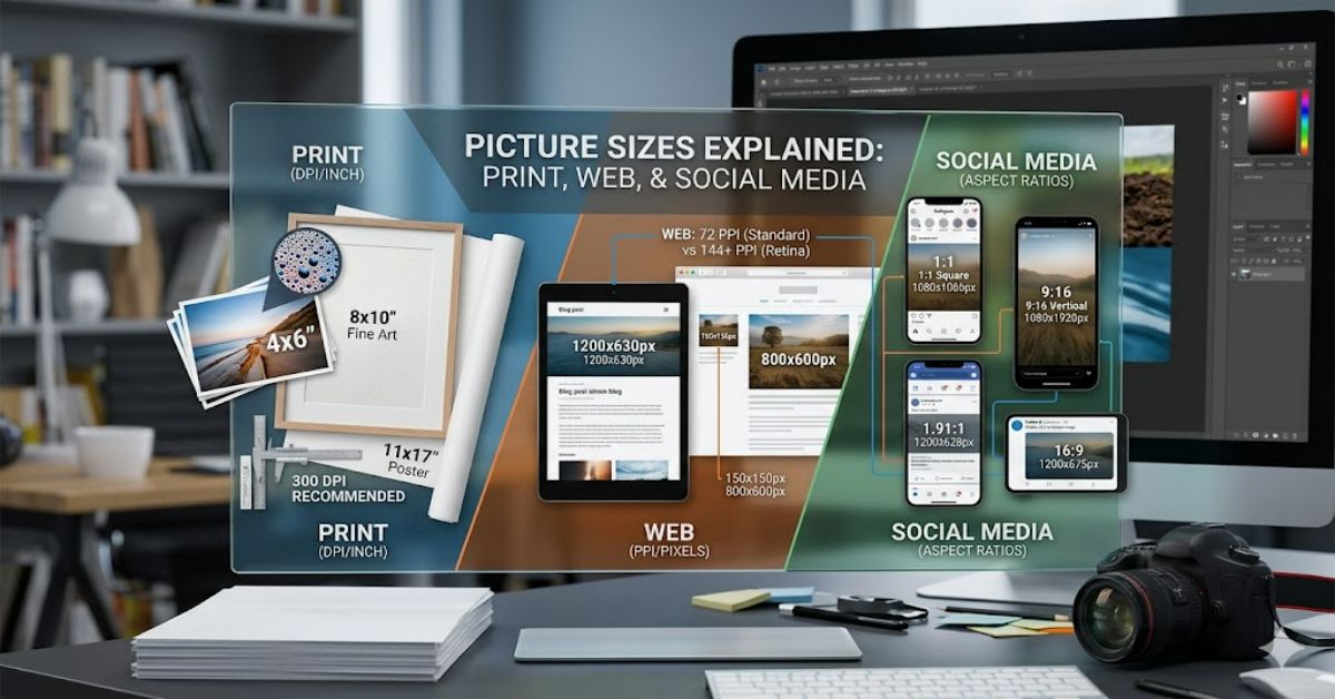
Different platforms impose their own requirements. Instagram favours square or vertical formats, websites often prioritise responsive scaling, and print demands high-resolution files measured in DPI rather than pixels alone. These distinctions mean that selecting the right picture sizes is never a one-size-fits-all process.
This Picture Sizes Guide breaks down how picture sizes work across multiple contexts, why they matter, and how to choose the correct dimensions based on real-world use cases. It also explores practical workflows, risks of incorrect sizing, and the evolving standards shaping image optimisation today.
By the end, you’ll understand not only how to select appropriate picture sizes, but also how to avoid the most common mistakes that reduce visual quality across digital and print environments.
Systems Analysis: How Picture Sizes Actually Work
At a technical level, picture sizes are defined by pixel dimensions (e.g., 1920×1080) and aspect ratio (e.g., 16:9). However, the system behind them is more layered.
Digital platforms interpret images differently depending on compression algorithms, display density (Retina vs standard screens), and responsive layout rules. For example, a website may downscale a large image automatically, but social platforms often crop rather than scale, changing composition entirely.
A key distinction exists between:
- Pixel dimensions: Actual data size of the image
- Display size: How large the image appears on screen
- File size (KB/MB): Storage and loading performance metric
Comparison of Common Picture Sizes by Use Case
| Use Case | Recommended Picture Sizes | Aspect Ratio | Notes |
| Instagram post | 1080×1080 | 1:1 | Crops edges if incorrect |
| Website banner | 1920×600 | 3:1 | Must support responsive scaling |
| Print photo | 3000×4500 (approx) | 2:3 | Requires 300 DPI minimum |
| YouTube thumbnail | 1280×720 | 16:9 | Must remain readable at small scale |
Strategic Implications of Choosing Correct Picture Sizes
Selecting correct picture sizes directly affects engagement and performance. On websites, oversized images slow page load times, reducing SEO rankings. On social platforms, incorrectly sized visuals reduce click-through rates due to poor cropping or blurred previews.
From a branding perspective, consistent sizing reinforces visual identity. Companies that standardise picture sizes across campaigns maintain stronger recognition and reduce production inefficiencies.
Another key implication is storage optimisation. Large uncompressed images significantly increase bandwidth usage, especially for mobile users.
Risks and Trade-Offs
One major risk in managing picture sizes is over-compression. While reducing file size improves loading speed, it often introduces artefacts that degrade visual quality.
Another trade-off is between flexibility and consistency. Responsive websites require multiple image sizes for different screen widths, but maintaining these variants increases production complexity.
A further issue arises with third-party platforms. Social networks frequently change their recommended picture sizes, forcing continuous updates to creative assets.
Real-World Impact of Picture Sizes Guide
In e-commerce, incorrect picture sizes can directly reduce conversion rates. Product images that fail to display clearly on mobile devices lead to lower trust and higher bounce rates.
In media publishing, editorial platforms rely heavily on consistent sizing to maintain layout integrity. A single incorrectly sized image can break a grid system or distort article formatting.
In advertising, platforms like Meta Ads and Google Display Network enforce strict image size requirements. Failure to comply results in rejected campaigns or reduced ad delivery.
Data Insight Table: File Size vs Performance Impact
| Image Size (px) | Average File Size | Page Load Impact | SEO Effect |
| 800×600 | 150 KB | Low | Positive |
| 1920×1080 | 800 KB | Medium | Neutral |
| 4000×3000 | 3–5 MB | High | Negative |
Original Insights (Analytical Gaps)
- Many design workflows still default to high-resolution exports, even when platforms compress images heavily, leading to unnecessary bandwidth waste.
- Mobile-first browsing now dominates traffic in most regions, yet legacy desktop-based picture sizes remain widely used in templates.
- Image optimisation tools often ignore aspect ratio preservation, which causes subtle but cumulative branding inconsistencies across campaigns.
The Future of picture sizes in 2027
By 2027, picture sizes will likely be less about fixed dimensions and more about adaptive rendering systems. AI-driven compression and responsive image delivery (such as AVIF and next-generation WebP variants) will automatically adjust image resolution based on device, bandwidth, and viewing distance.
Regulatory pressure on digital accessibility is also expected to increase, especially in the UK and EU, requiring clearer optimisation standards for web imagery.
Edge computing may further reduce the relevance of static image sizing by generating dynamic assets in real time.
Key Takeaways
- Picture Sizes Guide are defined by pixels, aspect ratio, and output medium.
- Incorrect sizing affects performance, SEO, and user experience.
- Responsive design requires multiple image variants for flexibility.
- Compression must balance speed with visual integrity.
- Future systems will rely on adaptive AI-based image scaling.
Conclusion
Picture sizes are no longer a simple design detail—they are a core part of how digital and print systems deliver visual content. From social media grids to high-resolution print layouts, selecting the correct dimensions ensures clarity, consistency, and performance across platforms.
As seen throughout this Picture Sizes Guide influence everything from SEO performance to user engagement and storage efficiency. The challenge lies in balancing quality with optimisation, particularly as platforms continue to evolve their formatting requirements.
The shift toward responsive and AI-driven image systems suggests that rigid sizing standards will become less dominant over time. However, current workflows still depend heavily on precise control of dimensions, making understanding these fundamentals essential for creators and businesses alike.
Ultimately, mastering picture sizes is about more than technical compliance—it is about ensuring visual communication remains effective across increasingly fragmented digital environments.
Structured FAQ
What are standard picture sizes for social media?
Standard picture sizes vary by platform, but common formats include 1080×1080 for Instagram posts and 1200×630 for Facebook link previews. These ensure proper scaling and visibility.
Why do picture sizes matter for websites?
Incorrect picture sizes can slow down page load speed and negatively impact SEO rankings. Properly optimised images improve performance and user experience.
What is the best picture size for printing photos?
Most professional printing uses 300 DPI resolution, typically translating to large pixel dimensions such as 3000×4500 for high-quality prints.
How do aspect ratios affect picture sizes?
Aspect ratio determines image shape. If mismatched, images may be cropped or stretched, affecting composition and visual balance.
Can I use the same picture size everywhere?
No. Different platforms require different picture sizes due to display constraints and layout systems.
What happens if image files are too large?
Large files slow loading times, increase bandwidth usage, and may negatively affect SEO and user engagement.
References (APA)
Adobe. (2024). Image resolution and resizing best practices. Adobe Help Center.
Google. (2025). Page speed and image optimisation guidelines. Google Search Central.
W3C. (2023). Responsive images and srcset specification. World Wide Web Consortium.
UX Design Institute. (2024). Visual hierarchy and digital image sizing principles. UXDI Publications.


